Showing posts with label sleek. Show all posts

Friday, 22 March 2013

EOTD - Eyes of the Day #9

ENG: I've already posted a review about one of the newest Sleek palette from the PPQ Shangri La collection: I'm talking about the Supreme. As I've written before, it's an unusual palette with an unusual range of colors, a peculiar item that I'm enjoying a lot! So... Here I am with a makeup made with it!
ITA: ho già postato una recensione su una delle nuove palette della Sleek dalla collezione PPQ Shangri La: parlo della Supreme. Come ho scritto in quell'occasione, è una palette insolita con un range di colori insolito, ma, pur nella sua peculiarità, me la sto godendo un sacco! E così... Ecco un trucco fatto con lei!
USED PRODUCTS / PRODOTTI USATI:
Primer / Primer: Kiko - Eye Base Primer - info here
Inner corner / Angolo interno: Sleek - Supreme palette - 10 Delfonic - review here
Eyelid / Palpebra mobile: Sleek - Supreme palette - 5 Grand Master Flash - review here
Outer corner / Angolo esterno: Sleek - Supreme palette  - 3 Bronx Black + 9 Al Green - review here
Eye crease / Piega dell'occhio: Sleek - Supreme palette - 4 P-Funk + 9 Al Green - review here
Shadow to blend on the edges / Ombretto per sfumare ai bordi: nothing!
Highlighter / Illuminante: Mac - Blanc Type
Eyeliner / Eyeliner: nothing!
Kajal / Rima interna: Sleek - Supreme palette - 3 Bronx Black - review here
Lower eyelid / Palpebra inferiore: nothing
Mascara / Mascara: E.L.F. - Waterproof Lengthening & Volumizing Mascara - pics here
Eyebrows / Sopracciglia: Sleek - Supreme palette - 3 Bronx Black - review here

Tuesday, 5 March 2013

Sleek - i-divine palette - Bad Girl

ENG: an old release from Sleek you can still find into the permanent collection: a palette with a bunch of smokey shades plus a couple of highlighters. By the way, let's see the details:
PROS: some eyeshadows are great, both in quality and colors: numbers 3, 4, 7, 9 and 11 are simply amazing. A very useful palette for smokey eyes lovers. I love the basic idea of proposing a line with neutral shades from white to black, and another one with colors, although they are very very dark. 
CONS: first of all, too much similarity between some shades (5, 6 e 8): they could be replaced in a more useful way (for example, for an actual green). Formula is too fluctuating, there' a big gap between good things and bad ones, even inside a single eyeshadow! Highlighters are quite disappointing to me: I'd prefer a shimmer and a matte, or maybe continuing on the darks path.
CONCLUSIONS: I can't decide... There's a problem: eyeshadow I love are just the half from the palette. I love them a lot, but just the half... If I should replace some shades, then it will become an amazing palette. Despite this, does it worth its price? Probably yes, for more or less 10 euros, but I think it is more suitable for who doesn't own many products, or who loves smokey eyes and is learning how to realize them without spending a lot, but for everybody else... I can't decide...


ITA: una vecchia palette Sleek che trovate ancora tranquillamente nella collezione permanente: un bel po' di cialde per smokey e un paio di highlighters come extra. Ma vediamola nel dettaglio:
PRO: alcuni ombretti sono eccezionali sia in qualità, sia in tonalità: i numeri 3, 4, 7, 9 e 11 sono semplicemente fan-ta-sti-ci. Palette utilissima per le amanti degli smokey eyes, e ottima l'idea di base di proporre una riga di neutri dal bianco al nero, e una riga di colori, sebbene scurissimi.
CONTRO: io direi, senza dubbio, la somiglianza di alcune tinte tra di loro (5, 6 e 8), che le renderebbero di fatto sostituibili in modi più proficui (come un verde che si capisca che è un verde, per esempio). La formulazione è molto altalenante, c'è un gap notevole tra alti e bassi, a volte perfino all'interno di una singola cialda. Abbastanza deludenti i due illuminanti, e, a mio parere, è anche superfluo che siano entrambi shimmer, tanto valeva continuare sulla scia dei colori scuri.
CONCLUSIONI: sono combattuta... Il problema è che le cialde che amo sono a malapena la metà, sebbene quelle poche le ami davvero molto... Se un giorno mi dovessero girare, e non è escluso che succeda, sostituirei qualche ombretto e diventerebbe una palette fantastica. Vale lo stesso il suo prezzo? Per 10 euro o poco meno probabilmente sì, ma forse è più adatta a chi non ha molti ombretti, o a chi ama gli smokey e/o vuole imparare a farli senza spendere capitali, ma in altri casi... Sono combattuta...


ENG: let's go with the roundup of all shades:
1 - INNOCENCE: a shimmer, sheer and powdery white, better as highlighter than eyeshadow
2 - GULLIBLE: a shimmer skin pink that's very sheer when's dry, but well pigmented when's wet
3 - BLADE: a metallic silver, very powdery (massive fall out) but extremely pigmented
4 - GUN METAL: a dark super-metallic silver, great dry but amazing wet: long lasting and creamy
5 - UNDERGROUND: a satin charchoal, it's poor pigmented and doesn't blend well, failed
6 - NOIR: a great matte (almost) black, a bit chalky but very long-lived, perfect as eyeliner
7 - INTOXICATED: a metallic dark forest green, very good formula and amazing wet
8 - ENVY: a very dark green (with a bit of imagination), a lot of fall out and just fairly pigmented
9 - OBNOXIOUS: one of my favorite dark blue ever: matte, silky and a wonderful eyeliner when wet
10 - ABYSS: a very dark blue jeans with a satin finish, poor pigmented but very long lasting
11 - TWILIGHT: an enchanting satin purple! not so well blendable, but a lot pigmented and durable
12 - REBEL: a mat burgundy a bit chalky and poor pigmented when's dry, but wet is... wow


ITA: via con la solita carrellata di descrizioni, cialda per cialda:
1 - INNOCENCE: un bianco shimmer, sheer e polveroso, migliore come highlighter che ombretto
2 - GULLIBLE: un rosa carne shimmer, poco pigmentato da asciutto, ma niente male da bagnato
3 - BLADE: un argento metallico, molto polveroso (massiccio fall out) ma estremamente pigmentato
4 - GUN METAL: argento scuro metallico, ottimo asciutto ma grandioso bagnato: durevole e cremoso
5 - UNDERGROUND: un antracite satin, poco pigmentato e si sfuma male, bocciato
6 - NOIR: un ottimo (quasi) nero mat, un po' gessoso, ma molto longevo, perfetto come eyeliner
7 - INTOXICATED: un verde foresta scuro metallico, ottima formula ed eccezionale da bagnato
8 - ENVY: un verde (con un po' di fantasia) satin molto scuro, tanto fall out e solo media scrivenza
9 - OBNOXIOUS: uno dei miei blu scuri preferiti: mat, setoso, e, da bagnato, un meraviglioso eyeliner
10 - ABYSS: un blue jeans molto scuro satinato, poco scrivente ma estremamente durevole
11 - TWILIGHT: un incantevole viola satin! non granchè da sfumare, ma pigmentatissimo e durevole
12 - REBEL: un borgogna mat un po' gessoso e poco pigmentato da asciutto, bagnato, invece... wow

ENG: and don't forget the RAINBOW CHALLENGE every Thursday! See ya! ;D
ITA: e non dimenticatevi della RAINBOW CHALLENGE, ogni giovedì, proprio qui! ;D

Tuesday, 26 February 2013

EOTD - Eyes of the Day #8

ENG: since I've written a review about the Sleek Original palette, then I've decided to try a makeup with it for the blog. Blending is slight and the makeup is quite different from my usual looks, but I like it anyway. Hope to being not the only one. :P
ITA: visto che di recente ho postato una recensione sulla Sleek - Original, ho pensato di usarla per un trucco occhi per il blog. Non ho sfumato tantissimo e tutto il trucco è alquanto diverso dai miei look abituali, però mi piace abbastanza lo stesso. Spero di non essere l'unica. :P
USED PRODUCTS / PRODOTTI USATI:
primer: / primer:
Kiko - Eye Base Primer - info here
inner corner: / angolo interno:
Sleek - Original palette - 7 - review here
Kiko - Chic Chalet LE - 02 Luxurious Gold and Plum - 1 - swatches here
eye crease: / piega dell'occhio:
Sleek - Original palette - 10 + 11 - review here
eyelid: / palpebra mobile:
Sleek - Original palette - 12 - review here
outer corner: / angolo esterno:
Sleek - Original palette  - 1 - review here
Kiko - Chic Chalet LE - 02 Luxurious Gold and Plum - 2 - swatches here
shadow to blend on the edegs: / ombretto per sfumare ai bordi:
I don't remember! XD
highlighter: / illuminante:
Nothing! :P
kajal: / rima interna:
Kiko - Double Glam Eyeliner - 08 Silver and Pearly Black - swatches here and here
mascara: / mascara:
Essence - I ♥ Extreme Mascara - pics here
eyeliner: / eyeliner:
Sleek - Original palette - 1 - review here
eyebrows: / sopracciglia:
A Kiko matte dark brown mono eyeshadow, don't remember the number, sorry :P

ENG: and don't forget the RAINBOW CHALLENGE next Thursday the last date! ç_ç
ITA: non dimenticate la RAINBOW CHALLENGE il prossimo giovedì sarà l'ultimo! ç_ç

Tuesday, 12 February 2013

Sleek - i-divine palette - Original

ENG: this palette has no need of many words, because it is the most well-known and sold palette from the British brand Sleek. Sleek renewed the formulation of these eyeshadows recently: the surface is now smooth and not like a waffle as previously; but the most important thing is that the consistence is less friable than before; shadows are still very powdery, but more creamy and dense, definitely much better.
I'm not going to do my usual list color by color this time, because all shadows has the same quality and technical details that you can already find in pros and cons descriptions.
PROS: first of all, the pigmentation! Every single shadow is highly pigmented and writes with no need of taking much product. More, they blend very well; all these eyeshadows have extreme shimmer and deepness, they are longevous and, last but not least, the palette has a great range of colors: it's not complete, but diversified and very well balanced between "basics" and peculiar shades.
CONS: I'm totally in love with this palette, why I should to force myself finding defects? Ok, I'll try... Shimmer shades (11 of 12) are powdery, but I'm quite sure no one will commit suicide for this. There isn't a light matte for blending, but you all already own a lot of them, so don't complain too much, please. There's a massive fall out, but you just need to keep more attention and use a few tricks. Ah! There is no bright pinks. But I hate bright pinks, so yay! How many unforgivable lacks... Why the hell I bought it? Because I love it!!! Find by yourself the lacks, I refuse to do something nonsense like this! And now I must to go to my palette and give it a little kiss. I don't want it thinks I don't love it as much as it deserves.
CONCLUSIONS: if you like these colors, then buy it with no fuss. I was forgetting: it's A LOT better in real life than photos!
ITA: questa palette non ha sicuramente bisogno di molte presentazioni, perché è, probabilmente, la palette più famosa, ed anche la più venduta, del brand inglese Sleek. Va anche detto che, nell'ultimo anno, la Sleek ha riformulato la qualità di questi ombretti: ora le cialde sono lisce in superficie e non tipo wafer; ma soprattutto non tendono più a sgretolarsi appena le si sfiora, come succedeva in precedenza; sono ancora alquanto polverose, ma più compatte e cremose, decisamente migliorate.
Questa volta non farò la lista colore per colore, perché in questa palette le cialde hanno tutte le stesse caratteristiche tecniche, che trovate già descritte nei pro e contro.
PRO: prima di tutto, la pigmentazione! Ogni singola cialda scrive tantissimo, senza bisogno di insistere nel prelevare il prodotto, e, nonostante questo, si sfumano tutte egregiamente. Altri pregi di questi ombretti sono l'estrema brillantezza e profondità dei colori, la loro durata, e, ultimo ma non ultimo, un range di colori variegato, non completissimo, ma molto ben bilanciato tra tinte "basiche" e altre più particolari.
CONTRO: sono follemente innamorata di questa palette, perchè costringermi a doverle trovare dei difetti? Ok, ci provo... Le cialde shimmer (11 su 12) sono polverose, ma ci suicideremo per questo? Anche no. Manca un mat chiaro per sfumare, ma ne ho già? Na caterva. Gli ombretti durante l'applicazione sono soggetti facilmente a fall out? Ci starò più attenta. Non c'è un rosa più acceso? Meglio, io odio il rosa. Quanti intollerabili difetti ha questa palette, accidenti, perchè l'ho comprata? Perchè la adoro!!! Trovateveli voi i difetti, io mi rifiuto! E ora vado a darle un bacino, non vorrei si sentisse trascurata.
CONCLUSIONI: se vi piacciono i colori che propone, compratela senza tante fregnacce. Dimenticavo: dal vero è TANTO più bella che in foto.

ENG: and don't forget the RAINBOW CHALLENGE every Thursday! See ya! ;D
ITA: e non dimenticatevi della RAINBOW CHALLENGE, ogni giovedì, proprio qui! ;D

Tuesday, 5 February 2013

EOTD - Eyes of the Day #7

ENG: since I've written a review about the new Sleek palette called Respect, then I decided to do a makeup with it. I think this could be a day-and-night makeup with no problems. Hope you like it! ^^ 
ITA: visto che di recente ho postato una recensione sulla nuova palette della Sleek, la Respect, ho pensato di usarla per un trucco occhi. Credo che questo makeup possa andare bene sia per il giorno che per la sera senza problemi. Spero vi piaccia! ^^
USED PRODUCTS / PRODOTTI USATI:
primer: / primer:
Kiko - Eye Base Primer - info here
inner corner: / angolo interno:
Sleek - Supreme palette - 6 Wah Wah White - review here
eye crease: / piega dell'occhio:
Sleek - Respect palette - 2 James Brown + 8 Vandellas - review here
eyelid: / palpebra mobile:
Sleek - Respect palette - 11 O'Jays - review here
outer corner: / angolo esterno:
Sleek - Respect palette  - 7 Roberta Black - review here
shadow to blend on the edges: / ombretto per sfumare i bordi:
Sleek - Respect palette - 10 Motown Mink - review here
highlighter: / illuminante:
Sleek - Respect palette - 4 Count Basi Beige - review here
kajal: / rima interna:
Kiko - Double Glam Eyeliner - 08 Silver and Pearly Black - swatches here and here
mascara: / mascara:
E.L.F. - Studio Waterproof Lenghtening and Volumising Mascara - pics here
eyeliner: / eyeliner:
Sleek - Respect palette - 7 Roberta Black - review here
eyebrows: / sopracciglia:
A random black eyeshadow :P

ENG: and don't forget the RAINBOW CHALLENGE every Thursday! See ya! ;D
ITA: e non dimenticatevi della RAINBOW CHALLENGE, ogni giovedì, proprio qui! ;D

Tuesday, 29 January 2013

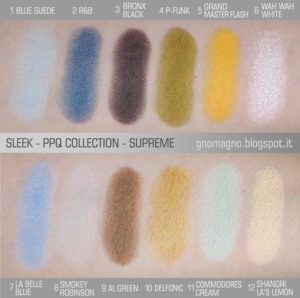
Sleek - PPQ Shangri La collection - Supreme palette

ENG: one of the 2 new palettes released by Sleek in the collection made in collaboration with PPQ. I've already swatched and reviewed the other one, RespectHERE.
PROS: an almost total matte palette (the highlighter is the only one no matte) with unusual colors like olives? To my tastes, this is a big win. But there's even more: a few delicate shades to soften the strong ones; a very good quality of formula (not a so common thing for mattes), despite some chalky pots; and an interesting choice of well matched quads... A total win!
CONS: I can find just an only one shortage in this palette, and it's about the pastel shadows plus the grey. They are very chalky and you'll need to work them more than usual to obtain an even application.
CONCLUSIONS: this is an unusual palette about the range of colors, and you can realize it at the very first glance at it. Since shades are so peculiar, then the palette couldn't fit to all skintone types: I think it is perfect for mediterranean and tanned skins, and couldn't fit so well for pale and pinkish skins. By the way, I refuse to put this thing in the "cons" list, because you can wear any kind of color, you just need to use your fantasy to find smart tricks. This isn't a needful palette, I'm aware of it, but I think it offers a variety of   uncommon combos, with a good quality and low cost.
ITA: una delle 2 nuove palette della Sleek, realizzate in collaborazione con PPQ. L'altra, la Respect, l'ho già swatchata e recensita QUI. In Italia le trovate da Sephora, ma dovrebbero essere in edizione limitata.
PRO: una palette quasi totalmente matte (solo l'highlighter non lo è) con colori inusuali come i verdi oliva, è, per i miei gusti, già un "pro" grande come una casa. Consideriamo poi il valore aggiunto di   alcune tinte delicate per stemperare i toni forti; una qualità sopra la media per dei matte (nonostante qualche cialda polverosa); e la proposta, a mio parere, di 3 quad abbinati molto bene; i "pro" sono una bomba.
CONTRO: l'unica carenza che trovo in questa palette è l'inferiore qualità delle cialde pastello e del grigio chiaro, molto "gessose", e bisogna lavorarle un po' per ottenere un risultato omogeneo e pieno.
CONCLUSIONI: che sia una palette diversa dal solito, in quanto a range di colori, è evidente dal primo sguardo. Avendo colori particolari è di conseguenza non adattissima a tutti i sottotoni di pelle: credo sia perfetta per pelli mediterranee e di colore, mentre potrebbe non abbinarsi troppo su pelli pallide e rosate. Non me la sento, comunque, di annoverare questa caratteristica tra i difetti: con qualche trucco cromatico potete indossare qualsiasi colore, basta applicarsi un po' e inventarsi alcune soluzioni furbe. Non è sicuramente una palette indispensabile, ma per chi, come me, piace tentare ogni tanto con colori insoliti, offre una varietà di combinazioni non banali, gran qualità, e con una spesa molto contenuta.
ENG: let's go with the roundup of all shades:
1 - BLUE SUEDE: a sky blue, not very pigmented neither durable, but well blendable
2 - R&B: a dark blue super matte, very pigmented but sheer, a silky formula and very long lasting
3 - BRONX BLACK: a charchoal black extremely pigmented and longevous, blend it as soon as you can
4 - P-FUNK: a medium olive crazily pigmented, a not conventional shade with a great quality!
5 - GRAND MASTER FLASH: a bright dark yellow a bit chalky but with a strong final effect
6 - WAH WAH WHITE: the only no matte shadow, a frost white, creamy and with a great formula
7 - LA BELLE BLUE: a light periwinkle, no big lacks, no big credits, just a good one
8 - SMOKEY ROBINSON: a light grey that disappears on my skintone, chalky and not so pigmented
9 - AL GREEN: a browny olive, average pigmented but excellent in everything else
10 - DELFONIC: a light olive almost mustard, another very good shade in blending and duration
11 - COMMODORES CREAM: a pastel mint pigmented but chalky, well blendable but not long lasting
12 - SHANGRI LA'S LEMON: a pastel buttery yellow very close in formula to the previous one
ITA: via con la solita carrellata di descrizioni, cialda per cialda:
1 - BLUE SUEDE: un delicato azzurro, non molto pigmentato nè durevole, ma ben sfumabile
2 - R&B: un blu scuro mat, molto pigmentato ma un po' sheer, formula setosa e molto longevo su pelle
3 - BRONX BLACK: un nero quasi antracite estremamente scrivente e durevole, da sfumare in fretta
4 - P-FUNK: un oliva medio follemente scrivente, una tonalità non convenzionale di grandiosa qualità
5 - GRAND MASTER FLASH: un acceso giallo scuro un po' polveroso ma con un forte effetto finale
6 - WAH WAH WHITE: l'unico ombretto non mat, un bianco frost cremoso e con una formula eccezionale
7 - LA BELLE BLUE: un pervinca chiaro senza infamia e senza lode, una buona cialda e amen
8 - SMOKEY ROBINSON: un grigio chiaro che scompare sul mio sottotono di pelle, anche gessoso
9 - AL GREEN: un oliva/marrone di media pigmentazione ma eccellente in tutto il resto
10 - DELFONIC: un oliva giallastro quasi mostarda, un'altra cialda di ottima qualità in sfumabilità e durata
11 - COMMODORES CREAM: menta pastello pigmentato ma polveroso, sfumabile ma non durevole
12 - SHANGRI LA'S LEMON: un giallo burro pastello molto simile nella formula al precedente

ENG: and don't forget the RAINBOW CHALLENGE every Thursday! See ya! ;D
ITA: e non dimenticatevi della RAINBOW CHALLENGE, ogni giovedì, proprio qui! ;D

Saturday, 12 January 2013

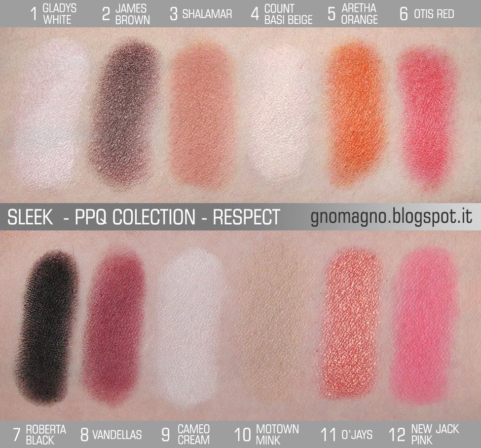
Sleek - PPQ Shangri La collection - Respect palette

ENG: this is one of the 2 last palettes released by Sleek in the collection made in collaboration with PPQ. Luckily they were also available very soon in Italy, and I picked up both ;D
Pros: almost all of shades have a silky formula and an amazing longevity; if you are not a fussy person, this palette could also be an  everyday & all-face palette, a very useful passe-partout! 
Cons: many colors are not so well blendable, so it's better to do it as fast as possibile; more, there are too many highlighters close to each other and with a medium/low quality, this is a pity...
Conclusions: I noticed that many shades are very close to other colors from other Sleek items, especially from Au Naturel palette (numbers 2, 3, 4, 9 and 10) and the Lace blush trio (colors 6 and 11). I think Au Naturel is a very good item, but no so needful if you already own other basics of good quality (I prefer that nudes have a higher level of formula), and I want to be sincere: I wouldn't bought Au Naturel and Lace if the Respect palette would have been released as first, because this palette is enough for my everyday needs, despite the three almost-white shades, that could have been replaced better.
ITA: questa è una delle ultime 2 palette della Sleek, realizzate in collaborazione con PPQ. Fortunatamente sono uscite anche in Italia molto presto, e così le ho prese entrambe! ;P
Pro: quasi tutte le cialde hanno una formula setosa e una durata eccezionale; se non siete schizzinosi questa può essere una palette da ogni giorno e anche all-face, un passe-partout molto utile!
Contro: molti colori non sono facilmente sfumabili, ed è meglio sfumarli appena applicati prima che si fissino; ci sono troppi illuminanti simili e di qualità discutibile, e questo è davvero un gran peccato...
Conclusioni:  ho notato che ci sono diverse cialde simili ad altri colori di altri prodotti Sleek, soprattutto dalla palette Au Naturel (numeri 2, 3, 4, 9 e 10) e dal trio di blush Lace  (6 e 11). Penso che la Au Naturel sia un egregio prodotto, ma non così indispensabile se già si possiedono colori basici di buona qualità (e io preferisco che i nude abbiano un livello qualitativo maggiore), e sarò sincera: non credo avrei acquistato la Au Naturel nè il trio Lace se la palette Respect fosse uscita prima, perchè è più che sufficiente alle mie necessità quotidiane, nonostante i tre illuminanti, che avrebbero potuto essere sostituiti meglio.
ENG: let's go with the roundup of all shades:
1 - GLADYS WHITE: a matte white, quite chalky and not much long lasting, but a decent highlighter
2 - JAMES BROWN: a cold brown with a slight shimmer, great pigmentation and duration, amazing!
3 - SHALAMAR: a matte bricked ochra with a wonderful formula, a bit sheer but silky and longevous
4 - COUNT BASI BEIGE: a white cream mat, medium/low quality but enough as base
5 - ARETHA ORANGE: a bright shimmer orange very very veeeeery long lasting
6 - OTIS RED: a satin coral well blendable and with an amazing longevity, I'd use it as blush, too
7 - ROBERTA BLACK: a matte black, silky, extremely pigmented and long lasting, perfect as eyeliner
8 - VANDELLAS: a burgundy supermat, silky and durable, but no so pigmented as I wished
9 - CAMEO CREAM: a good white cream highlighter, even and well pigmented
10 - MOTOWN MINK: a beige matte, poor pigmented, but good as blender
11 - O'JAYS: the star of the palette, for sure, a golden rose super shimmered with a flawless formula
12 - NEW JACK PINK: a matte bright barbie pink perfect as blush and a very good quality
ITA: via con la solita carrellata di descrizioni, cialda per cialda:
1 - GLADYS WHITE: un bianco mat, un po' gessoso e non molto durevole, ma è un illuminante decente
2 - JAMES BROWN: un marrone freddo lievemente shimmer, grande pigmentazione e durata!
3 - SHALAMAR: un ocra mattone con una formula meravigliosa, un po' sheer ma setoso e longevo
4 - COUNT BASI BEIGE: un bianco panna mat, di qualità medio/bassa ma comunque buono come base
5 - ARETHA ORANGE: un brillante arancio shimmer molto molto mooooolto durevole
6 - OTIS RED: un corallo satin ben sfumabile e con durata eccezionale, io lo userei anche come blush
7 - ROBERTA BLACK: nero mat setoso, estremamente pigmentato e longevo, perfetto come eyeliner
8 - VANDELLAS: un bordeaux supermat, setoso e durevole, ma non così pigmentato come speravo
9 - CAMEO CREAM: un buon illuminante bianco panna, ben pigmentato e stesura omogenea
10 - MOTOWN MINK: un beige mat poco pigmentato, ma utile per sfumare
11 - O'JAYS: la star della palette! un rosa dorato super shimmer con una formula perfetta
12 - NEW JACK PINK: un brillante rosa barbie mat perfetto come blush e di ottima qualità

Wednesday, 2 January 2013

EOTD - Eyes of the Day #5


ENG: another Eyes of the Day. I noticed that I always do the same makeup, just changing colours! My skills about makeup are... Or not are...? Ok, whatever... XD
ITA: ecco un altro Eyes of the Day. Ho notato che io faccio sempre lo stesso identico trucco, e cambio giusto i colori! XD Il mio talento makeupparo, del resto, si sa che è... O non è...? Vabbeh, amen... XD
USED PRODUCTS / PRODOTTI USATI:
- KIKO - EYE BASE PRIMER
primer / primer
-  SLEEK - SUNSET PALETTE - colours 5 + 10 - review here
inner corner / angolo interno
- SLEEK - SUNSET PALETTE - colours 4 + 9review here
eye crease / piega dell'occhio
- MAC - BLANC TYPE
eyelid / palpebra mobile
- SLEEK - SUNSET PALETTE - colours 7 + 8 - review here
outer corner / angolo esterno
- MAC - WEDGE
shadow to blend the outer corner / ombretto per sfumare l'angolo esterno
- MAC - BLANC TYPE
highlighter / illuminante
- NEVE COSMETICS - PASTELLO AVORIO
kajal / rima interna
- E.L.F. - STUDIO WATERPROOF LENGHTENING AND VOLUMISING MASCARA 
mascara / mascara
- SLEEK - SUNSET PALETTE - colour 1 - review here
eyeliner / eyeliner
- [B]BASIC - EYEBROW PENCIL - 03 BLACK
eyebrows / sopracciglia

Friday, 23 November 2012

Sleek - blush by 3 - Sugar

ENG: here we are with my second (and my last) trio from the Blush by 3 collection from Sleek: the Sugar one. You can find the review of my other trio, Lace, in this post. By the way, let's talking about Sugar: maybe this is the less "famous" palette of the entire collection, probably the reason is why it has got 3 unusual colours for blushes, quite far from the easier oranges, corals, pinks, etc... I think Sugar is a must-have for mediterranean and medium-dark skintones, but not just for them.
ITA: eccoci al secondo (e ultimo) trio che possiedo della linea Blush by 3 della Sleek: Sugar. Potete trovare la recensione dell'altro in mio possesso, Lace, cliccando qui. Ma veniamo alla palette Sugar: è forse la meno famosa tra le 5 che la Sleek ha messo in vendita, probabilmente perchè i 3 colori contenuti sono un po' anomali rispetto ai classici arancioni, corallo, rosa, ecc... Ad ogni modo credo siano tinte ideali per le pelli mediterranee, o comunque medio-scure, ma vi spiegherò perchè possono andar bene anche per le altre.
ENG: the Sugar trio, as I earlier mentioned, has 3 peculiar colours, perfect for olive skintypes, but don't think that other people with different skintones can't join this beauty: if you use it wisely, then it will be a very close friend of you. Any single blush has a unique formulation that can be applied in more than just one specific way to get the most from its full potential; you can also try combos for a light contouring; or use them as eyeshadows and base for lipglosses, so you'll obtain a matched all-face makeup. 
- DEMERARA: a matte red berry. It's not so much pigmented neither blendable, like the most of other Sleek blushes, but it's a very good thing to me: this colour is very evident on your cheeks and this kind of formulation avoids you to overdo it. I think this shade is perfect for a small and defined area, also because it's very long lasting, so you can trust of it since the moment when you put it on your face. It's a dupe of Sleek - Flushed, that you can buy as single blush, if you like it and you don't need of the entire trio. I also guess this could be an amazing lipgloss!
- MUSCOVADO: this one is a brown with red undertone and golden shimmer. It's super pigmented (almost creamy) and super well blendable. With this kind of formula you can decide the ammount of colour you prefer on your cheeks, and there's more: if you decide to apply it generously (or as eyeshadow, it's s-t-u-n-n-i-n-g as eyeshadow!) the shimmer gold will be very strong and glistening, so this look could be perfect on tanned and dark skins, or in the summer season; but if you decide to apply it lighter and then blend it a lot, the finish will be a very classy satin, that matches very good with a warm day look, or even as bronzer. If you love this shade, you could be also interested in the mono blush Sleek - Sunrise, that's a dupe of this one. 
- TURBINADO: a matte bricktoned orange. This blush could be weird at the first glance, but it's very lovely on cheeks: not much pigmented (the sheerest in this trio), but extremely blendable, so it's very buildable. I think it's very beautiful in combo with the other ones, to add some hint of orange to shades less wearable than this. It's hasn't got a dupe in the Sleek range of mono blushes.
ITA: il trio Sugar  si caratterizza, come già accennato, per possedere 3 colori decisamente particolari per dei blush, ma comunque adattissimi a pelli olivastre. Non crediate, però, che gli altri fototipi non possano usufruirne con soddisfazione: se utilizzati con sapienza possono essere quel qualcosa che fa la differenza nel vostro beauty-case. Ogni cialda ha una formulazione che può essere usata in più maniere per sfruttarne tutta la loro potenzialità; potete anche sperimentarli in combinazione per un leggero contouring; nonchè usarli come ombretti o come base per lipgloss, al fine di creare un makeup pendant per tutto il viso.
- DEMERARA: un fard matte di color rosso ciliegia matura (ma che minchia sto a dì? XD). Non è così tanto pigmentato, nè così ben sfumabile come la maggior parte degli altri blush della Sleek, ma credo sia una buona cosa per un colore come questo, che è comunque molto evidente sulle guance, e una formulazione di questo tipo vi evita eccessi nell'applicazione. Penso anche che questa tinta sia perfetta per piccole e definite aree, perchè ha una durata su pelle lunghissima, e potete quindi fidarvi di lui una volta che l'avete indossato. Pare inoltre sia uguale allo Sleek - Flushed, che potete acquistare singolarmente, se questo colore vi piace e non volete l'intero trio. Credo anche che sarebbe bellissimo come lipgloss! 
- MUSCOVADO: un marrone con sottotono rossastro e shimmer dorato. E' super pigmentato (quasi cremoso) ed anche super sfumabile. Con questo tipo di formulazione avete un blush modulabile a piacimento, e non è tutto: se decidete di applicarlo generosamente (o come ombretto, è f-i-g-h-i-s-s-i-m-o come ombretto!) l'effetto shimmer sarà molto forte e scintillante, perfetto per pelli scure o abbronzate, o comunque per la stagione estiva; se però decidete di applicarlo più sobriamente e sfumarlo molto, otterrete un elegantissimo finish satinato, che calza a pennello per un look da giorno caldo, o perfino come bronzer. Se vi piace questo colore, potreste anche essere interessati al mono Sleek - Sunrise, che ne è un dupe. 
- TURBINADO: e infine un arancio mattone mat. Questo blush potrebbe sembrare strano ad una prima occhiata, ma in realtà è davvero carino sulle guance: non è molto pigmentato (è il più traslucido del trio), ma in compenso è estremamente sfumabile, è pertanto modulabile a vostro piacimento con grande facilità. Penso sia bellissimo in combinazione con gli altri due colori, per aggiungere giusto quell'accenno di arancio agli altri, che sono un po' meno portabili di questo. Non ci sono suoi cloni nel range di blush della Sleek.

Wednesday, 14 November 2012

Sleek - blush by 3 - Lace

ENG: since the first time I've seen the preview of the 5 palettes of blushes from Sleek, I fell in love with  them with no hope of redemption... I'm not a blush fan, and actually I don't use blush most of times, but they are so much pigmented that they can be also used as eyeshadows. Until I learn how to properly apply blushes, I'll enjoy these products anyway! So I gave up and now I own 2 trios: Lace and Sugar are my choices and I'm going to review the first one right now! ;)
ITA: dalla prima volta in cui ho visto le 5 palette di blush della Sleek me ne sono follemente innamorata... Non sono una fan dei blush, anzi, spesso io manco me lo metto il blush, ma questi sono così tanto pigmentati che si possono tranquillamente usare anche come ombretti, e così, mentre imparo come si applicano correttamente i fard, posso godermi comunque questi prodotti! Così alla fine ho ceduto a 2 trio: Lace e Sugar sono state le mie scelte, e, per adesso, potete leggere la mia review sul primo! ;)
ENG: Lace trio is maybe the passe-partout of the entire collection, because these 3 shades are probably the most easy ones to match with different skintones. They are super-duper-hyper pigmented but also very well blendable, so you can decide the intensity of the colour on your cheeks. I guess you'll obtain the best application with a dual fibre brush.
- CHANTILLY: the perfect matte orange blush. It's very pigmented but a bit powdery, so you'll need to pay attention to the ammount of product you'll pick up from the palette. If you like it and you would own it alone, it's almost a dupe of Sleek - Pan-Tao, just... It's discontinued, sorry! XD
- GUIPURE: the star of this trio is a peachy pink with tons of golden shimmer. I often use it as eyeshadow when I have no time and I just need for a bit of color and light on my eyelids. If you love this shade, you could be also interested in the mono blush Sleek - Rose Gold (just a bit lighter) or the blush part in the new Sleek - Face Form Contour Kit in Fair (just a bit darker), or maybe the Neve Cosmetics - Starfish (less pigmented and with less shimmer, but the color of base and shimmer are exactly the same). 
- CROCHET: is a matte coral well balanced between red and pink. It's more sheer than the others, and for a good reason: to avoid the Heidi look! Applied with discreption, you'll look healthy for sure!
ITA: il trio Lace è forse il passe-partout dell'intera collezione, perchè questi 3 colori sono probabilmente i più facilmente abbinabili ai diversi sottotoni di pelle. Sono molto molto molto mooolto pigmentati, ma anche molto ben sfumabili, pertanto potete decidere il livello di intensità di colore sulle vostre guance. Credo che, per un'applicazione ottimale, sia bene usare un pennello a doppia fibra.
- CHANTILLY: il perfetto blush arancio mat. E' molto pigmentato ma un po' polveroso, pertanto fate un po' di attenzione a quanto ne prelevate dalla cialda, perchè ne basta davvero poco. Se vi piace e lo vorreste in versione singola, il suo quasi dupe è lo Sleek - Pan-Tao, solo... E' fuori produzione, mi spiace! XD
- GUIPURE: la star di questo trio è un rosa pesca con dentro una caterva di shimmer dorato. Io uso spesso questo blush anche come ombretto, soprattutto quando non ho tempo e ho bisogno giusto di un po' di colore e luce sulla palpebra mobile. Se vi piace questa tinta, potreste anche essere interessati al blush singolo Sleek - Rose Gold (che è giusto un ciccio più chiaro) o il blush del nuovo trio Sleek - Face Form Contour Kit - Fair (che è giusto un ciccio più scuro), o anche il Neve Cosmetics - Starfish (meno pigmentato e riflettente, ma con gli stessi colori, sia della base che dello shimmer). 
- CROCHET: è un corallo mat ben bilanciato tra il rosso e il rosa. E' più traslucido degli altri, ma per una buona ragione, ovvero evitare l'effetto Heidi! Applicato con discrezione, l'effetto salute è assicurato!

Thursday, 8 November 2012

EOTD - Eyes of the Day #4

ENG: a quick post for an old experiment. "There's nothing so experimental, here", you could say... And you're right, but I'm a newbie of makeup and this was my first blending try. There are a lot of mistakes (for example, too much white all around my eyes, and it's terrifying, I'm aware of it...) but I was quite proud of myself for the good mixture of three colors, at least. :D
ITA: un post veloce per mostrarvi un vecchio esperimento. "Non c'è mica niente di sperimentale, qui", direte voi... E avete ragione, ma, come vi dico sempre, io sono una novellina del trucco e questo è stato il mio primo tentativo di sfumare insieme più colori. Ci sono un sacco di errori (per esempio troppo bianco intorno agli occhi, è terrificante, ne sono consapevole...) ma ero comunque piuttosto orgogliosa di me per come ho miscelato insieme tre colori. Perlomeno questo, dai! :D
USED PRODUCTS / PRODOTTI USATI:
- E.L.F - Mineral Eyeshadow Primer
primer / primer
-  KIKO - Chic Chalet LE - Color Fever Eyeshadow Palette - 02 Luxurious Gold and Plum
inner corner / angolo interno
- KIKO - Mono Eyeshadow - 111 Smeraldo Scuro Perlato
eyelid and crease / palpebra mobile e piega
- SLEEK - i-divine palette - Bad Girl - 07 Intoxicated + 08 Envy
outer corner / angolo esterno
- KIKO - Light Impulse LE - Double Glam Eyeliner - 08 Silver and Pearly Black
kajal / rima interna
- MAC - matte2 - Blanc Type
highlighter / illuminante
- E.L.F. - Studio Waterproof Lenghtening and Volumising Mascara
mascara / mascara
- [B]BASIC - Eyebrow pencil - 03 Black
eyebrows / sopracciglia

Sunday, 4 November 2012

TOTALLY RANDOM SUNDAY #27

HAULS
ENG: just a few gifts to myself from cheapland! :D
ITA: giusto una manciata di auto-regali da economicolandia! :D
SLEEK - PPQ SHANGRI-LA COLLECTION - RESPECT + SUPREME PALETTES
ENG: I would to resist, I swear, I sweeeeear!!! But it can't be helped, Sleek palettes are evil: they have great quality, elegant packaging, easy to use and carry with, but, especially, cheap! No regrets! è_é/
ITA: io volevo resistere, lo giuro, lo giuuuuroooo!!! Ma non c'è niente da fare, le palette Sleek sono il male: ottima qualità, confezione elegante, comode da usare e portarsi dietro, ma soprattutto, economiche! Nessun rimpianto! è_é/ *DISPONIBILI IN ITALIA DA SEPHORA A €9,90 CADAUNA! ADESSO!!!*
H&M - ANTIQUE GOLD
ENG: I went to H&M with my cousin Barbara (visit her blog! :D) and my friend Daniela. We were leaving the store when Dany yelled "WALLIIIIS"!!! Don't it seem a lot like that Butter London nail polish? We thought so... Maybe over a dark base... :D
ITA: ero alla H&M con mia cugina Barbara (visitate il suo blog, filate! XD) e la mia amicicia Daniela, stavamo uscendo dal negozio, quando Dany ha urlato "WALLIIIIIIS"!!! Non somiglia un sacco a quello smalto della Butter London? Noi abbiamo pensato di sì... Magari sopra una base scura... :D
H&M - NO MAMBO JAMBO
ENG: I need of a filter in my brain to resist to teals... I need it... Seriously...
ITA: ho bisogno di un filtro nel cervello per resistere agli ottani... Ne ho seriamente bisogno...
H&M - CORAL ROSE
ENG: I wanted to try a bright orange/red/coral shade (wtf is this? XD) but I didn't want to spend a lot of money just for a try, so... H&M saved me with 99 cents! :D
ITA: volevo provare un arancio/rosso/corallo (che cassius di colore è? XD) molto intenso, ma non volevo spendere un sacco di soldi solo per vedere come mi stava, e... La H&M mi ha salvato con 99 centesimi! :D

NEXT POSTS
- Nail Art: Fall Patchwork Manicure with Scotch Tape - on Tuesday, 2012.11.06
- EOTD #4: Gold and Green - on Thursday, 2012.11.08

ENG: that's all for this week, see ya! ;D
ITA: è tutto per mo', se vedemo bagigi! ;D

Friday, 2 November 2012

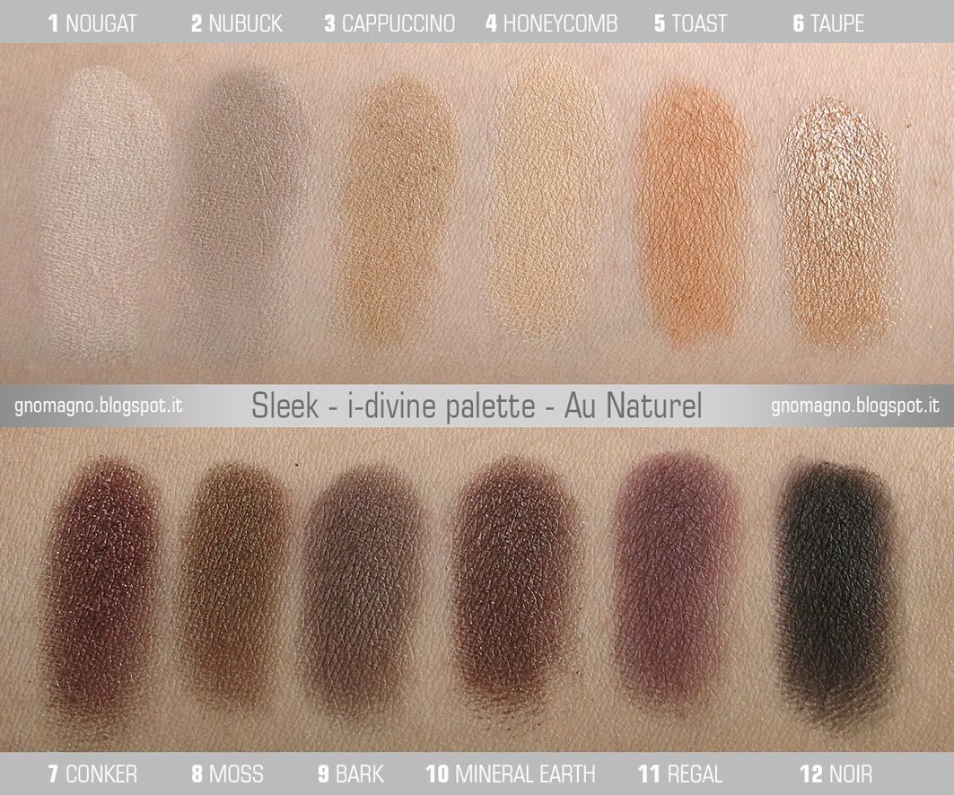
Sleek - i-divine palette - Au Naturel

ENG: another Sleek palette to review, but this time no many pics, since it's a simple and linear palette and I think that one pic is enough to understand the shades and the finishes properly. :)
Pros: formulation of Sleek palettes is getting better and this time the most of colours is silky and very well blendable, so this palette is very useful for fast and easy makeups, since it's very easy to work with it.
Cons: I have to admit that the range of colors is a bit "weird" for an everyday palette: there are too many warm highlighters that don't suit perfectly for all skintones; moreover, there aren't medium shades to blend the light colours with the darker ones together, or to create a gradiation, or to just have more combos / options / possibilites to choose from.
Conclusions: I guess this is a great and useful palette, just... Not "for everyone" as its name could suggest.
ITA: un'altra palette della Sleek da recensire, ma questa volta non metterò molte immagini, perchè questa è una palette semplice e lineare, e un'immagine è più che sufficiente per comprenderne bene colori e finish. :)
Pro: la formula degli ombretti Sleek sta decisamente migliorando: la maggior parte delle cialde sono setose e facilmente sfumabili. Per questi motivi, credo che questa palette sia perfetta per trucchi facili e veloci.
Contro: devo ammettere che la gamma di colori è un po' "strana" per una palette da tutti i giorni: ci sono troppi illuminanti caldi che non stanno bene su tutti i sottotoni di pelle; inoltre mancano tonalità intermedie per sfumare insieme quelle chiare e scure; o per creare una gradazione, o per avere semplicemente più combinazioni di colori possibili tra cui scegliere.
Conclusioni: credo sia una fantastica ed utile palette, solo... Non per tutti, come potrebbe suggerire il nome.

ENG: let's go with the roundup of all shades:
1 NOUGAT: a matte cream white, this one is extremely silky and very well blendable
2 NUBUCK: a matte grey with just a hint of brown, the worst shade in the palette, unfortunately: very poor pigmented and short duration on eyelids
3 CAPPUCCINO: a matte warm beige not much pigmented and durable, but very silky, very useful for blending other colors, in case your skintone matches with it (that's my case, luckily)
4 HONEYCOMB: a matte light ochra, almost a nude if you're asian or your skintone is a light olive like mine, it's also very even, silky and blendable, I use it as "base" on eyelids most of times
5 TOAST: another matte, this time the shade is an orangey medium ochra , well pigmented and blendable
6 TAUPE: first of all, this isn't a taupe, but a champagne! XD Secondly, it's so shimmery that's almost creamy when it's wet, most pigmented shade in the palette and also long lasting
7 CONKER: a shimmer (metallic when wet) brown with a hint of burgundy, the most durable one, also the most powdery, but still an amazing eyeshadow
8 MOSS: maybe the weirdest shade in this palette, but it's also my favorite! This is a yellowish brownish olive (??? XD), it's satin-almost-shimmer, well pigmented and blendable ans silky, a great product!
9 BARK: a classic matte warm brown perfect for eyebrows
10 MINERAL EARTH: another great shade: a shimmer dark bronze, but metallic when's wet
11 REGAL: how to define this shade? A plummy brown? The finish is matte but it seems almost a satin under bright lights; formula is a bit chalky and not so blendable for this reason
12 NOIR: the inevitable mat black, very well pigmented, extremely durable on eyes, but pay attention to blend it as soon as you apply it, since you won't be able to do it afterwards
ITA: e via con la solita carrellata, cialda per cialda:
1 NOUGAT: un color panna mat, estremamente setoso e molto ben sfumabile
2 NUBUCK: un grigio mat con solo un piccolo accenno di marrone, purtroppo la peggior cialda della palette: molto poco pigmentata e di durata brevissima sulle palpebre
3 CAPPUCCINO: un beige mat non molto pigmentato e durevole, ma molto setoso, comunque utilissimo per sfumare gli altri colori, in caso il vostro sottotono di pelle ci faccia pendant (fortunatamente è il mio caso)
4 HONEYCOMB: un ocra mat chiaro, quasi un nude se siete asiatici o avete la pelle olivastra chiara come la mia; molto omogeneo e setoso, facilmente sfumabile, io lo uso spesso come "base" sulle palpebre mobili
5 TOAST: un altro mat, questa volta è un ocra medio aranciato, molto pigmentato e sfumabile
6 TAUPE: prima di tutto, non è un taupe, ma uno champagne! XD Secondo, è così brillante che sembra quasi un ombretto cremoso da bagnato, il più pigmentato della palette e anche molto durevole
7 CONKER: un marrone molto shimmer (metallico da bagnato) con una punta di borgogna, il più durevole tra tutti e anche il più polveroso, ma resta comunque un ombretto favoloso
8 MOSS: forse il colore più bizzarro in questa palette, ma anche il mio preferito! E' un oliva marroncino giallognolo (??? XD), un satin-quasi-shimmer, ben pigmentato e sfumabile, e anche setoso: gran prodotto!
9 BARK: un classico marrone caldo mat perfetto per le sopracciglia
19 MINERAL EARTH: un altro colore eccezionale! Un bronzo scuro shimmer, metallico da bagnato
11 REGAL: come definire questo colore? Un marrone prugnoso? Il finish è opaco, ma, sotto luci molto intense, sembra quasi un satin; polveroso nella formulazione, e per questo motivo non è molto sfumabile
12 NOIR: l'immancabile nero mat, molto ben pigmentato ed estremamante durevole sugli occhi, fate  solo attenzione di sfumarlo appena lo applicate, perchè non sarete più in grado di farlo successivamente

Wednesday, 17 October 2012

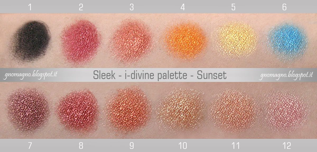
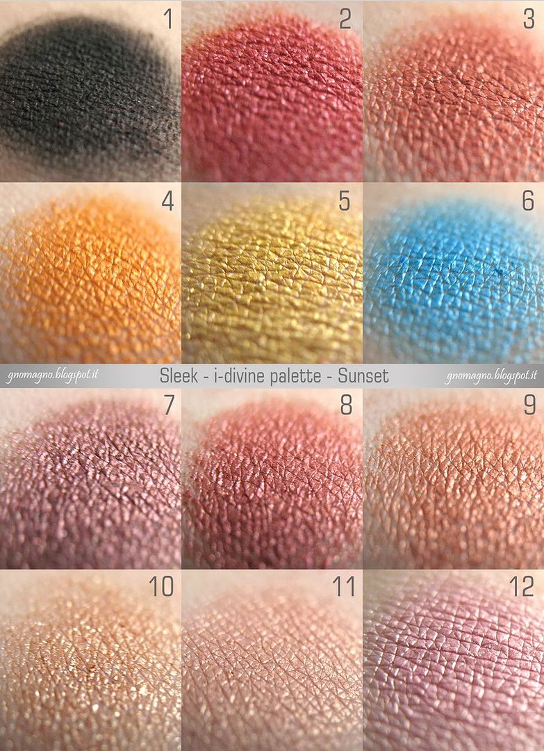
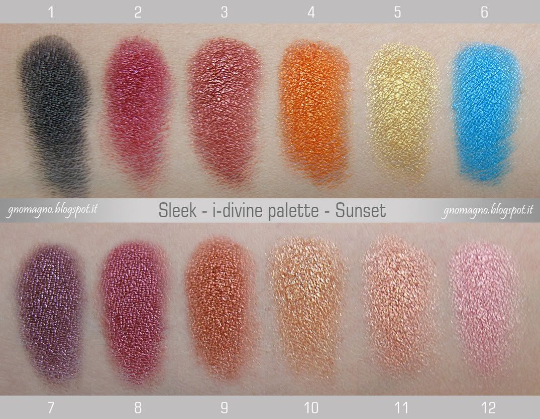
Sleek - i-divine palette - Sunset

ENG: here I am with another review of a Sleek palette, and this time is the time of the Sunset palette, my favorite with no doubts. I think the leit motiv of this palette is a massive pigmentation, even the most of  eyeshadows are very powdery. You won't find colors that don't paint as much as you wish, and a couple of them will probably paint much more than you would! Despite the great pigmentation, they are easily blendable; more they are very intense dry, but they are like molten metal if wet, amazing. The range of color is not various but coherent, 'cause this is a "palette with a theme", except for the crazy turquoise, that's still stunning. Some reviews say that a few colors are too similar to each other, but it's not a problem to me, because this kind of colors stands out better if you use tints close to each other to blending together, so i think this isn't a limit, but, at the opposite, a well studied resource!
ITA: ecchime qua con un'altra recensione di palette della Sleek, la Sunset. Delle 5 che ho, questa è senza dubbio alcuno la mia preferita, nonostante la consistente polverosità di quasi tutte le cialde. Direi che il leit motiv della Sunset sia la pazzesca pigmentazione, perchè non troverete colori che non scrivano quanto vorreste, e un paio di loro scrivono forse perfino troppo! A dispetto dell'ottima scrivenza, sono quasi tutti estrememante sfumabili, inoltre sono intensi già da asciutti, ma risulteranno talmente metallici da sembrare quasi metallo fuso se li bagnate. Il range di colori non è variegato, è una palette "a tema" e ne resta coerente, a parte quel folle turchese, messo un po' ad cazzum, ma comunque stupendo. Alcuni lamentano che alcune tinte siano troppo simili tra loro, personalmente non lo trovo un problema, perchè questo genere di colori risalta molto di più se sfumate colori simili uno accanto all'altro, e quindi penso che, in realtà, la somiglianza tra i colori non sia un limite, ma anzi una risorsa ben studiata!
ENG: roundup of all colors and my bullshit opinions:
1 - matte black very good pigmented, not so blendable, but estremely long lasting;
2 - pomegranate red that is more better wet, but its strongest point is its great blendness when dry;
3 - rust red with a long long long duration on lids;
4 - bright orange that reinvents the meaning of bright! The most pigmented and intense color in this palette;
5 - pure gold is less pigmented and more powdery than the others but still good;
6 - the outsider of this palette is a great turquoise that's not so blendable, but who cares? It's a star!
7 - I can't describe this color, it's the Bogie color to me (like the China Glaze nail polish :P), long duration;
8 - another rust shade but more reddish than the number 3 and more durable on lids;
9 - an amazing copper blendable like a blush, intense and almost creamy;
10 - a champagne color, the most powdery in this palette and poor pigmented, but good for highlight;
11 - warm pink that's something wow if you wet it, because it becomes like a cream eyeshadow;
12 - cool pink creamy when is wet like the previous one.
ENG: carrellata di tutti i colori con le mie personali cazzate opinioni:
1 - nero mat molto pigmentato, non molto sfumabile, ma estremamente durevole;
2 - rosso melograno che migliora un sacco bagnato, ma il suo punto di forza è la sua sfumabilità da asciutto; 
3 - un rosso ruggine con una durata davvero sorprendente sugli occhi; 
4 - arancione brillante che reinventa completamente il concetto di brillante! Il più pigmentato e intenso; 
5 - un color oro puro che è meno pigmentato e più polveroso degli altri, ma  comunque buono come qualità; 
6 - il turchese è l'outsider di questa palette, non è molto sfumabile, ma chi se ne frega? Lui è una star!
7 - non so descrivere questo colore, per me è il color Bogie (come lo smalto China Glaze :P), lunga durata;
8 - un altro ruggine ma più rossastro del numero 3 e anche più durevole sugli occhi; 
9 - un meraviglioso rame sfumabile come un blush, intenso e quasi cremoso;
10 - non poteva mancare un champagne, il più polveroso e meno pigmentato, ma ottimo come illuminante; 
11 - un rosa caldo che è assolutamente "wow" da bagnato, diventa quasi un ombretto in crema; 
12 - un rosa freddo molto cremoso da bagnato, come il suo amiquetto qui sopra. 
COMPARISONS / CONFRONTI
ENG: three comparison between eyeshadows from the Sunset palette and the other Sleek palettes I own.
Sunset 6 VS Original 4: the turquoise from Original palette is even more intense and metallic than the Sunset one, but the base color is exactly the same. 
Sunset 7 VS Au Naturel 7: the "bogie" color is slightly different from the similar shade in Au Naturel palette: reddish the first and brownish the second, more evident in real life. 
Sunset 12 VS Original 8: 2 perfect dupes. 
ITA: tre veloci confronti tra ombretti della Sunset palette con cialde da altre palette Sleek che possiedo. 
Sunset 6 VS Original 4: il  turchese della Original è perfino più intenso e metallico, ma il colore di base è assolutamente lo stesso. 
Sunset 7 VS Au Naturel 7: i due "bogie" sono leggermente diversi l'uno dall'altro: più rossastro quello della Sunset, più marrone l'altro, dal vero si nota di più che in foto, a dire la verità. 
Sunset 12 VS Original 8: due cloni identici. 

Wednesday, 3 October 2012

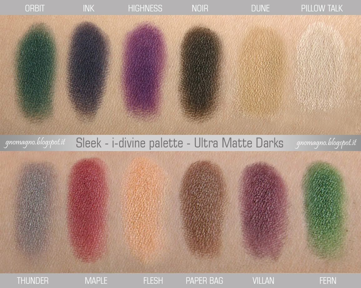
Sleek - i-divine palette - Ultra Matte Darks

ENG: this is my first review about Sleek palettes: I hope you'll find it useful and without usual things you can find everywhere in the blogosphere (price, dimensions, quantity of product, etcetera). I do prefer pics talk by themselves, but there are a few details about any single color I'd like to add, like this was a chat between friends where I do a sum-up after 2 months of try. :)
ITA: mi accingo alla mia prima recensione di palette Sleek: spero la troviate utile sebbene manchi delle solite informazioni (prezzo, dimensioni, grammi, eccetera) che potete, però, trovare davvero ovunque nella blogosfera. Preferisco che le immagini parlino da sole, ma ci sono alcuni dettagli sui singoli colori che mi piacerebbe comunque aggiungere, come se questa fosse una chiacchierata tra amiche e io vi faccio il riassunto di cosa ne penso dopo 2 mesi di prova. :)
ENG: what can I say that it hasn't been already told everywhere? It's a palette with matte colors only, they are not powdery as very often from Sleek, almost all of them are medium-high pigmented, it has a combination of colors and neutrals to not mix them without exceeding in the final look, and blah blah blah... What else? Actually not much, but I could advice this palette especially to people who are too affected to nude look and wants to try something different with no thrauma. Is red a weird color for a makeup? Does green not fit all colors eyes? Not at all, you can wear everything, really, EVERYTHING! Just find the right way for you, it always exists. I promise.
ITA: che dire di questa palette che non sia già stato scritto ovunque? E' una palette di soli colori matte, non polverosi come si temeva dalla Sleek, quasi tutti di scrivenza medio-alta, propone colori e tinte neutre da poter abbinare insieme in modo da non sembrare Moira Orfei fuggita dal circo, e bla bla bla... Che altro? Non molto, a dire il vero, ma potrei consigliare questa palette particolarmente a chi è troppo legata al nude look ma vuole finalmente provare qualcosa di diverso dal solito, ma senza traumi. Il rosso è un colore strano per un trucco? Il verde sta bene solo per certi colori di occhi? No, potete indossare qualsiasi cosa, QUALSIASI! Dovete solo trovare il modo giusto che fa per voi, ed esiste sempre. Ve lo garantisco. 
ENG: here we go with a sum-up of colors and a small review for any of them
ORBIT is a greenish teal, pigmented but very blendable, so you'll need to apply more layers if you want a well delimitated shape, but as long as you apply it, it won't go away, neither if you touch it, unbelievable;
INK is a very dangerous ultramarine blue, the most pigmented and intense color in this palette, be careful about the ammount of product you'll take, perfect as eyeliner;
HIGHNESS is a medium eggplant purple, not my favourite but still pretty, I must to admit that;
NOIR is less pigmented than the other blacks that Sleek used to give to us in its palettes, but it is the most durable shade in this palette and you can be sure that will stand on your eyes all day long;
DUNE is invisible on my skin, but I swear it does exist and it's perfect for blending the other colors;
PILLOW TALK is a white/cream a bit chalky and poor pigmented, but I guess it could be useful as discreet highlighter;
THUNDER is a medium neutral grey medium pigmented and medium blendable; 
MAPLE is one of my favourite from this palette, it's a bricktoned red, perfect for mediterranean skintones; 
FLESH is a sandy ocher that actually goes too yellowish on me and it's not enough pigmented for my taste, I had to insist a bit to do these swatches;
PAPER BAG (this name is pure genious!) is a passe-partout color, a warm chocolate brown that fits for every skintones and very good for eyebrows, extremely pigmented and silky;
VILLAN is a quite dark plum that needs a couple of layers and it's very blendable for a decise look;
FERN, another one of my favorites, a forest green very pigmented that enchanted me at first glance.
ITA: e  concludiamo con una panoramica di ogni singolo colore recensito velocemente
ORBIT è un ottanio verdastro, pigmentato ma molto sfumabile; se volete ottenere una forma ben definita, avrete bisogno di più passate di colore, però, una volta sugli occhi, non se ne andrà neanche se lo strusciate;
INK è un blu oltremare decisamente pericoloso, perchè è il colore più pigmentato ed intenso della palette, fate attenzione a quanto ne tirate su dalla cialda, è perfetto come eyeliner;
HIGHNESS è un viola melanzana medio, non il mio genere, ma devo ammettere che è comunque grazioso;
NOIR è un nero meno pigmentato degli altri neri a cui la Sleek ci aveva abituati, in compenso è l'ombretto più longevo di questa palette e potete stare certi che resterà sui vostri occhi tutto il santissimo giorno;
DUNE è invisibile sulla mia pelle, ma vi posso giurare che esiste (non è un mio amico immaginario) e che è perfetto per sfumare gli altri colori nella zona sotto l'arcata sopraccigliare;
PILLOW TALK è un bianco panna un po' gessoso e poco pigmentato, ma torna comunque molto utile se avete bisogno di un illuminante discreto;
THUNDER è un grigio neutro medio, mediamente pigmentato e ben sfumabile; 
MAPLE è uno dei miei preferiti in questa palette, un rosso mattone perfetto per le pelli mediterranee; 
FLESH è un color sabbia / ocra che, a dire la verità, è troppo giallognolo su di me e neanche abbastanza pigmentato per i miei gusti, infatti per questi swatches ho dovuto insistere perchè si vedesse bene;
PAPER BAG (questo nome è meraviglioso!) è un colore passe-partout, un marrone cioccolato caldo che sta bene praticamente su tutti i sottotoni di pelle, ottimo per le sopracciglia, pigmentatissimo e setoso;
VILLAN è un prugna piuttosto scuro che abbisogna di un paio di passate ed è molto ben sfumabile;
FERN, un altro dei miei preferiti, un verde fureshta molto pigmentato, che mi ha incantata da subito.

Friday, 28 September 2012

New: Sleek - PPQ Respect + PPQ Supreme

ENG: I did know nothing about these, but they are already for sale in the online store of Sleek, such an amazing surprise! I don't want to steel anything from them, so I'm just going to post a pic preview I edited with original 2 images and links of the official site with descriptions and shopping online. Drooling! :D
ITA: non avevo idea che stessero arrivando, ma sono già in vendita sul sito della Sleek, che sorpresa fantastica! Non voglio rubacchiare nulla, quindi mi limito a postare un'immagine preview che ho creato io unendo le immagini originali e links al sito ufficiale con la descrizione dei prodotti e negozio online. Sbavo! :D

PPQ RESPECT: CLICK HERE for info and shopping
PPQ SUPREME: CLICK HERE  for info and shopping

Saturday, 8 September 2012

EOTD - Eyes of the Day #1

I'm a lot more scared than I was in the previous makeup post, because, really, I'm a total newbie about makeup. I guess I've tried my first blending with eyeshadow a few months ago... In all my entire life!!! So, really, consider these posts just like a hobby, something to share with my friends, made only to play with colors. Of course feedbacks and critical and advices are more than welcome. Ah! My eyes have many many wrinkles and I don't care, more I'm veeeery lazy about my eyebrows. Have mercy! ;P
Me la sto facendo sotto molto di più adesso che in questo post precedente, perchè, sul serio, ma per davero, io, prima di una manciata di mesi fa, non avevo mai fatto un trucco occhi che andasse oltre a base color carne e mascara. Mai prima di pochi mesi fa in tutta la mia vita. Tutta. Vita. Tanti. Anni. Quindi, ecco, considerate questo nuovo tipo di post come un mero hobby, qualcosa che condivido con le amiche, e fatto solo per giocare coi colori. OvviamOnte sono ben accetti opinioni, consigli, critiche, ricchi premi e cotillons. Ah! I miei occhi hanno molte molte molte rughe, ma me ne fotto, in più sono assai pigra sulla cura delle mie sopracciglia, quindi abbiate pietà e tante belle cose! :P


PRODUCTS I'VE USED / PRODOTTI CHE HO USATO:
- KIKO - EYE BASE PRIMER
- SLEEK - I-DIVINE PALETTE - BAD GIRL
 - WET'N'WILD - COLOR ICON EYESHADOW COLL. - 737 BLUE HAD ME AT HELLO

- KIKO - BLOOMING ORIGAMI EYESHADOW PALETTE - 01 SWEET PASTELS 

- ESSENCE -  MASCARA - I ♥ EXTREME
- KIKO - KAJAL - KOHL PENCIL

- [B]BASIC - EYEBROW PENCIL - 03 BLACK
I wanted this look was a lot lighter on crease, but the first blue of the Sleek palette is crazily pigmented and it's pretty dangerous taking more than a pinch of color! The second blue was almost useless at that point! I think you can't see the Wet'n'Wild colors clearly in the pics, I've used them only to intensify the others. Kiko's, instead, were used from the inner corner to the first half, then blended with darker shades.
Volevo che sto look fosse mooooolto più leggero e piccirillo sulla piega, ma avevo sottovalutato la pigmentazione del primo blu della palettina Sleek. Ne ho preso appena poco più di una punta e avrei potuto usare l'avanzo per tinteggiare tutta casa senza problemi... Il secondo blu, in realtà, è stato inutile... I Wet'n'Wild non riscirete a vederli dalle foto degli occhi, perchè li ho usati solo per intensificare gli altri colori. Quelli Kiko, invece, li ho usati a partire dall'angolo interno dell'occhio fino a metà palpebra.