
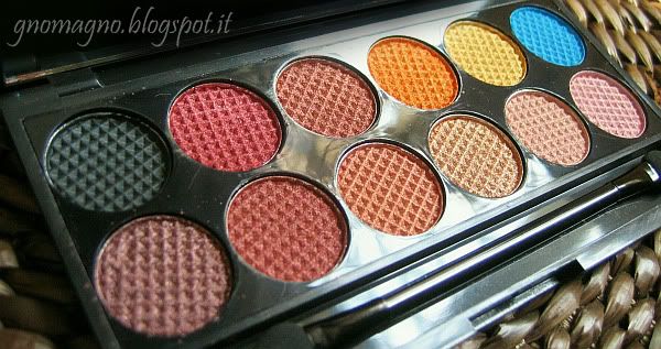
ENG: here I am with another review of a Sleek palette, and this time is the time of the Sunset palette, my favorite with no doubts. I think the leit motiv of this palette is a massive pigmentation, even the most of eyeshadows are very powdery. You won't find colors that don't paint as much as you wish, and a couple of them will probably paint much more than you would! Despite the great pigmentation, they are easily blendable; more they are very intense dry, but they are like molten metal if wet, amazing. The range of color is not various but coherent, 'cause this is a "palette with a theme", except for the crazy turquoise, that's still stunning. Some reviews say that a few colors are too similar to each other, but it's not a problem to me, because this kind of colors stands out better if you use tints close to each other to blending together, so i think this isn't a limit, but, at the opposite, a well studied resource!
ITA: ecchime qua con un'altra recensione di palette della Sleek, la Sunset. Delle 5 che ho, questa è senza dubbio alcuno la mia preferita, nonostante la consistente polverosità di quasi tutte le cialde. Direi che il leit motiv della Sunset sia la pazzesca pigmentazione, perchè non troverete colori che non scrivano quanto vorreste, e un paio di loro scrivono forse perfino troppo! A dispetto dell'ottima scrivenza, sono quasi tutti estrememante sfumabili, inoltre sono intensi già da asciutti, ma risulteranno talmente metallici da sembrare quasi metallo fuso se li bagnate. Il range di colori non è variegato, è una palette "a tema" e ne resta coerente, a parte quel folle turchese, messo un po' ad cazzum, ma comunque stupendo. Alcuni lamentano che alcune tinte siano troppo simili tra loro, personalmente non lo trovo un problema, perchè questo genere di colori risalta molto di più se sfumate colori simili uno accanto all'altro, e quindi penso che, in realtà, la somiglianza tra i colori non sia un limite, ma anzi una risorsa ben studiata!
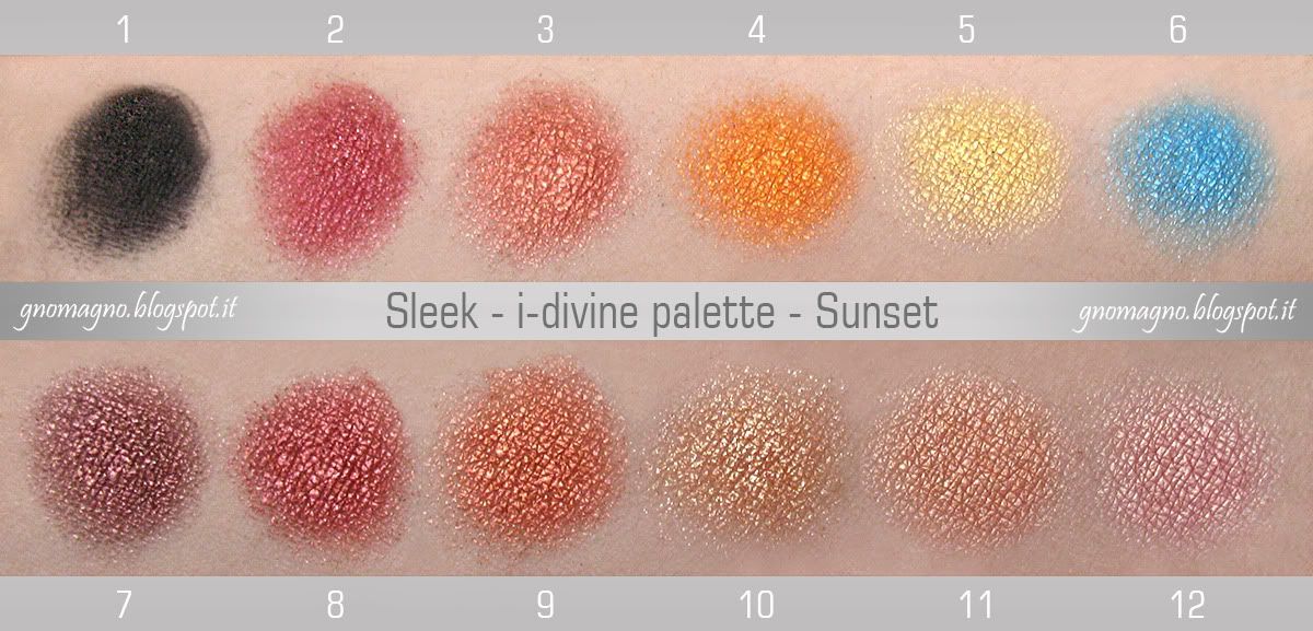
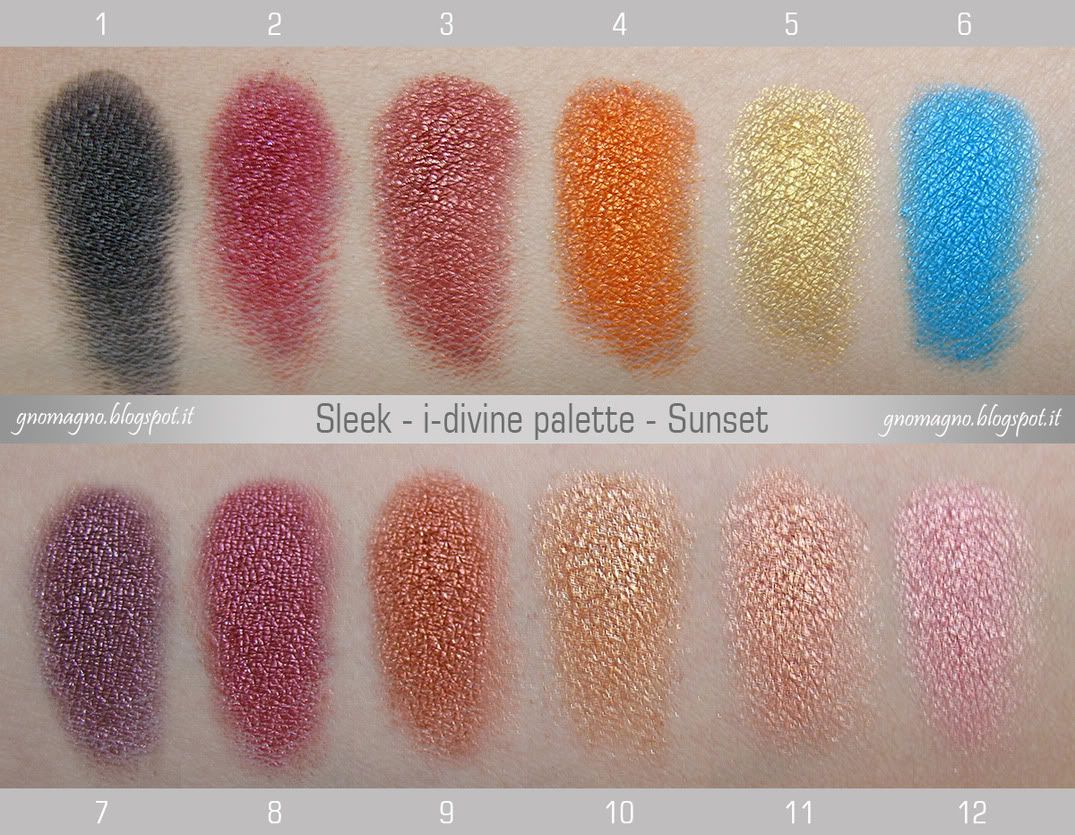
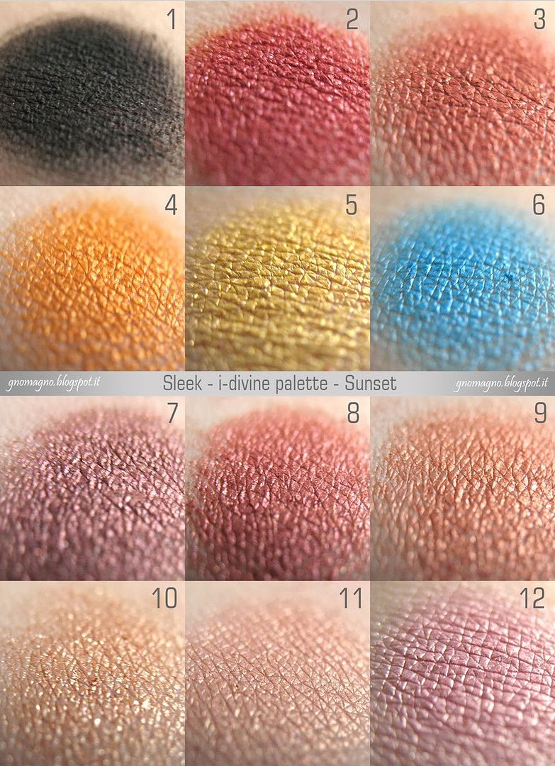
ENG: roundup of all colors and my bullshit opinions:
1 - matte black very good pigmented, not so blendable, but estremely long lasting;
2 - pomegranate red that is more better wet, but its strongest point is its great blendness when dry;
3 - rust red with a long long long duration on lids;
4 - bright orange that reinvents the meaning of bright! The most pigmented and intense color in this palette;
5 - pure gold is less pigmented and more powdery than the others but still good;
6 - the outsider of this palette is a great turquoise that's not so blendable, but who cares? It's a star!
7 - I can't describe this color, it's the Bogie color to me (like the China Glaze nail polish :P), long duration;
8 - another rust shade but more reddish than the number 3 and more durable on lids;
9 - an amazing copper blendable like a blush, intense and almost creamy;
10 - a champagne color, the most powdery in this palette and poor pigmented, but good for highlight;
11 - warm pink that's something wow if you wet it, because it becomes like a cream eyeshadow;
12 - cool pink creamy when is wet like the previous one.
ENG: carrellata di tutti i colori con le mie personali cazzate opinioni:
1 - nero mat molto pigmentato, non molto sfumabile, ma estremamente durevole;
2 - rosso melograno che migliora un sacco bagnato, ma il suo punto di forza è la sua sfumabilità da asciutto;
2 - rosso melograno che migliora un sacco bagnato, ma il suo punto di forza è la sua sfumabilità da asciutto;
3 - un rosso ruggine con una durata davvero sorprendente sugli occhi;
4 - arancione brillante che reinventa completamente il concetto di brillante! Il più pigmentato e intenso;
5 - un color oro puro che è meno pigmentato e più polveroso degli altri, ma comunque buono come qualità;
6 - il turchese è l'outsider di questa palette, non è molto sfumabile, ma chi se ne frega? Lui è una star!
7 - non so descrivere questo colore, per me è il color Bogie (come lo smalto China Glaze :P), lunga durata;
8 - un altro ruggine ma più rossastro del numero 3 e anche più durevole sugli occhi;
9 - un meraviglioso rame sfumabile come un blush, intenso e quasi cremoso;
10 - non poteva mancare un champagne, il più polveroso e meno pigmentato, ma ottimo come illuminante;
11 - un rosa caldo che è assolutamente "wow" da bagnato, diventa quasi un ombretto in crema;
12 - un rosa freddo molto cremoso da bagnato, come il suo amiquetto qui sopra.

COMPARISONS / CONFRONTI
ENG: three comparison between eyeshadows from the Sunset palette and the other Sleek palettes I own.
Sunset 6 VS Original 4: the turquoise from Original palette is even more intense and metallic than the Sunset one, but the base color is exactly the same.
Sunset 7 VS Au Naturel 7: the "bogie" color is slightly different from the similar shade in Au Naturel palette: reddish the first and brownish the second, more evident in real life.
Sunset 12 VS Original 8: 2 perfect dupes.
ITA: tre veloci confronti tra ombretti della Sunset palette con cialde da altre palette Sleek che possiedo.
Sunset 6 VS Original 4: il turchese della Original è perfino più intenso e metallico, ma il colore di base è assolutamente lo stesso.
Sunset 7 VS Au Naturel 7: i due "bogie" sono leggermente diversi l'uno dall'altro: più rossastro quello della Sunset, più marrone l'altro, dal vero si nota di più che in foto, a dire la verità.
Sunset 12 VS Original 8: due cloni identici.
Comments:
4 comments
 Gnoma Jessica

ma io... io... la voglio da un sacco di tempo, tu me la fai vedere così e e e
ReplyDeletepiango ;_;
è stupenda ;_;
Adoro queste recensioni, le fai da dio! Bellissima palette, forse non la prenderei per me perchè trovo che siano colori un po' difficili da portare nel quotidiano (specialmente se hai gli occhi azzurri), ma comunque restano degli ombretti stupendi!
ReplyDeleteBellissima lei *__*
ReplyDeleteutilissima la parte dei confronti! e hai ragione... che mazza ci fa lì quel turchese?? ahahahah xD amore folle a lei.
ReplyDelete